Cells, death, more cells!

Image result for hek293 dead cells trypan blue hemocytometer

It’s fun culturing cells! It’s not fun when you inject Trypan blue, and it penetrates your dead cells coloring them blue. Looking at blue cells and floating cellular debris under the light microscope on the hemocytometer feels pretty weird actually. That’s what happened with my batch of 50 mL cells, but fortunately, I got a new batch. That looks much better, and I’m growing it up. Last time, it was sitting at 180 mL of 1.9 million cells per mL. Tomorrow, hopefully, I’ll have around 700 mL near 2 million cells per mL, so I can transfect 2 batches of 300 mL cell cultures and make more of my protein of interest.

GRIPS – Ancestry Talk

Image result for ancestry dna

Last Friday, Natalie Telis from Ancestry gave a really interesting talk explaining how Ancestry works to find out who we are related to. Ancestry uses the genomes of people living in areas all over the world for generations as references to look for certain patterns with machine learning (specifically topic modeling) as indicative that you would be from that area. There are data biases (like the reference people being sequenced usually live near universities to get their DNA sequence).

Ancestry also uses other sources like existing family trees, records, and DNA sequences from previous people who have used the DNA kit. Through genetic clustering, they can group people into various communities. They can further narrow down the search by using annotations in the datasets, which include items like the place of birth and also government records which often have details about family migrations.

GRIPS – Research Update

heatmap

Last week, I was working on creating a heatmap using deepTools in Python to display Pearson/Spearman correlations of ChIP-Seq data. The goal is to implement it onto the Encode database at some point (e.g. show heatmaps of ChIP-Seq data across various tissues of a human donor or for a particular tissue across multiple human donors). I was able to generate a heatmap of all the different time points for cells treated with 100 nM of dexamethasone. Now, I’m working on integrating the backend with the frontend (displaying the heatmap using highcharts and react in JS).

GRIPS – Dr. Bam’s Talk


Image result for breast cancer

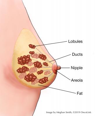
Last Wednesday, I listened to a really cool talk by Dr. Rakesh Bam. He’s working on developing a new method to break through in ultrasound molecular imaging for early breast cancer detection. There are 3 stages of breast cancer that are survivable; the fourth and final stage is really hard to battle against as that is when metastasis occurs. Thus, early detection of the cancer is key.

Mammography, ultrasounds, and MRIs are some of the ways to image breast tissue and detect breast cancer. Mammography is good for women with scattered fibroglandular tissue. It’s limited dealing with very dense breasts. Ultrasound uses 720 kHz sound waves to image soft tissue. However, differentiating signal from noise can be hard sometimes, and there are false positives in this screening. Contrast agents are one way to deal with this problem.

Dr. Bam is experimenting with microbubbles (going down the same avenue as contrast agents) to see if they can be a viable method of breast cancer detection. He uses targeted microbubbles; these microbubbles (gas-filled bubbles that are made of phospholipids) are tagged with receptors that can bind to ligands on cancer cells in the endothelial tissue of blood vessels. CD31, KDR, and B7-H3 are some of the biomarkers that Dr. Bam is working with.

In the tumor microenvironment, there are blood vessels supplying the cancer. The goal is for the microbubbles to bind to a cancer biomarker such as CD31 or KDR or B7-H3 in the growing blood vessels in the location of the tumor. These microbubbles carrying the contrast agent should enable better, more precise visualization of the tumor in the ultrasound. KDR and B7-H3 in the capillaries has been shown to be a good biomarker for tumor visualization in clinical trials. They tend to be overexpressed in cancer cells in blood vessels in the tumor, so there is better signal to noise ratio there (minimal or no binding to normal tissues as they don’t express these biomarkers compared to the cancer cells).

Image result for murine model microbubbles

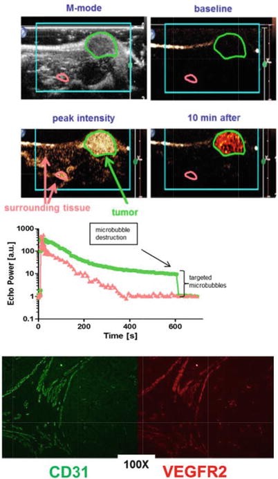
Note: The above image is from https://link.springer.com/chapter/10.1007/978-3-319-42202-2_14.

Dr. Bam has experimented with his microbubbles in murine models with random tumors with good results. He has been able to replace the antibody (serving as the receptor) latched onto the microbubble with a smaller yet still effective protein (antibodies are expensive to produce). This affinity protein also lets the microbubble circulate for minutes as opposed to the 48 hours using antibodies allowing for faster imaging.

In the future, Dr. Bam plans to experiment with other kinds of microbubbles and replace the biotin-streptavidin linkage (which connects the microbubble with the receptor) with a nontoxic alternative.

GRIPS Research – Stanford School of Medicine

Image result for ChIP heatmap

Looking forward to developing a program to show a lot of these pretty heatmaps…

Yesterday (Monday, June 17th, 2019 to be precise) was the official start of the GRIPS summer research program. It was pretty cool to see some familiar faces and meet some new ones at the orientation. There will also be lots of talks throughout the program that I look forward to going to.

I also talked with my awesome mentor and agreed to develop a visualization tool for ChIP-Seq data in Python and JavaScript. The plan is to develop heatmaps for various BigWig files from the Encode database (which the lab hosts by the way) from different types of data (e.g. same tissues across various human donors, various tissues across the same human donor, time series data, etc.). The eventual goal is to generalize the tool so that the user can pick which files can be inputted into the visualization tool. Using the tool, you can see how reliable the ChIP-Seq experiments were (by checking the correlation between replicates which should be reasonably strong in a good experiment). Then, you can look at other regions and see if there are high correlations there (which points to areas of interest for further investigation).

Nipah Virus Project Update

nipah-virus

Note: The fruit bat depicted above is the main vector for the Nipah virus.

I’m having a lot of fun working on the Nipah virus project. In March, I submitted my project to the BioGenius challenge (became a finalist!) and to the Synopsys Science Fair (honorable mention).

Since the Synopsys science fair, I have been focusing on obtaining more purified protein for my ELISA assays to get some clearer results (see my poster for more details).